Imagine sketching a wireframe on a napkin, and within seconds, watching that rough idea bloom into a fully-realized visual concept complete with color palettes, typography, and mood. That is no longer science fiction. With Midjourney, an AI image generator that has taken the creative world by storm, web designers can now shortcut the blank-page paralysis and land on directional layouts faster than ever. But here is the catch: Midjourney was not built to generate pixel-perfect, production-ready HTML. It is a brainstorming partner, a visual spitballer, and if you know how to talk to it, it can hand you a layout blueprint that you would have otherwise spent hours chasing in your head. This tutorial walks you through a repeatable workflow to feed Midjourney the right prompts so it outputs website layout concepts you can actually use in your next project.
Before diving into prompt engineering, get comfortable with Midjourney’s basic interface. Head over to the Midjourney Discord server or the web app, and make sure you have an active subscription (the Starter plan is usually enough for experimenting). Type /imagine in any bot channel to kick off a generation. The key here is understanding that Midjourney interprets natural language through a creative lens—it does not understand HTML, CSS, or responsive grid frameworks. It understands visual vocabulary: “modern,” “minimal,” “hero section,” “card grid,” “dark mode,” “glassmorphism.” The more precise your visual adjectives, the closer the output aligns with what you would actually build in Figma or Webflow.
The Anatomy of a Good Layout Prompt
The single most important skill you will learn today is how to structure a prompt. A Midjourney prompt for website layouts should follow this skeleton: [subject] + [style/theme] + [aspect ratio] + [visual modifiers] + [exclusion words]. For example, instead of typing “design a website,” which will give you generic floating buttons and stock-photo mockups, try this:
/imagine a landing page hero section for a SaaS startup, minimalist design with bold typography, soft gradient background, floating 3D UI elements, 16:9 aspect ratio --v 6
Notice the structure. You specified the subject (landing page hero), the mood (minimalist, bold typography), the environment (gradient background), and extra sauce (3D UI elements). The --v 6 flag forces the latest model version, which handles composition far better than its predecessors. You should also play with --ar 16:9 or --ar 3:2 because website mockups look cramped in square crops.
Taking the Output and Turning It Into a Real Layout
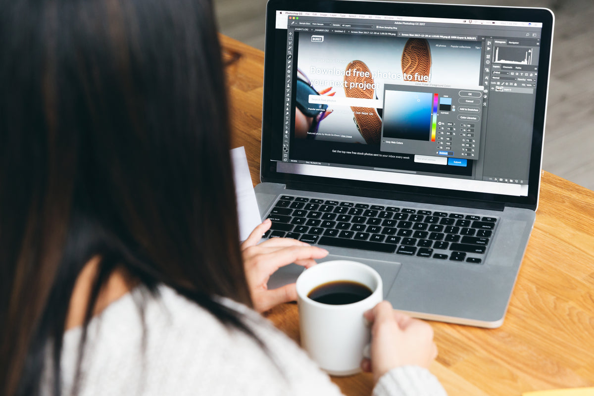
Here is where most people get stuck. Midjourney hands you four squares of beautifully-rendered chaos, and you think, “Okay, but how do I code this?” The trick is to stop treating Midjourney as a final render engine and start treating it as a mood reference. Pick the generated image that has the best composition, upscale it with the U buttons, and then use it as a visual compass when you open your editor.
Use the screenshot or the upscaled image as a guide for color palette extraction. I personally drag the image into Adobe Color or a browser extension like ColorZilla to pull out the dominant hex values. Then I reconstruct the layout hierarchy: what sits at the top? A hero headline? A navigation bar? A floating chat widget? Let the AI composition guide your design decisions without copying it verbatim. Think of it like hiring a junior designer who hands you a sketch—you still need to polish the pixels.
Refining With Style Modifiers
Midjourney’s secret weapon is its modifier ecosystem. Beyond basic adjectives, you can inject specific aesthetic keywords that dramatically change the output. Here are some power modifiers I have tested for web layout prompts:
- –s 250 to –s 1000: Stylize value. Lower numbers = Midjourney follows your prompt more literally. Higher numbers = more artistic license. For wireframes, keep it under 400. For polished final-art concepts, push it to 800.
- –chaos 10 to –chaos 50: Controls variety. Use higher chaos when you are stuck in a creative rut and want drastically different layouts.
- –iw 0.5 to –iw 2: Image weight. If you upload a reference image (a wireframe you sketched), higher iw makes Midjourney stick closer to it.
- Glassmorphism, neubrutalism, claymorphism: Drop these keywords to steer toward trending UI styles. Neubrutalism, for instance, gives chunky borders, harsh drop shadows, and vibrant monochromatic backdrops.
Do not be afraid to mix these. A prompt like /imagine a dashboard interface with neubrutalism style, bold yellow and black palette, card-based layout, --ar 16:9 --s 600 --v 6 can produce dashboard concepts that look straight out of a YouTube design tutorial.
Using Image References for Consistent Branding
Midjourney supports image prompts, and this is a game-changer for web designers who already have brand guidelines. Upload your existing brand style guide, logo, or a screenshot of your current site as an image reference. Add the image URL (upload it to Discord first) at the start of your prompt, then describe the new layout you want. The AI will try to preserve the color palette and overall vibe while generating a fresh composition. I use this technique to iterate on landing pages for clients without having to rebuild the brand identity from scratch every time.
Example:
/imagine [image-url] a landing page for a fintech company, dark blue and gold palette, clean lines, product mockup centered, --ar 16:9 --iw 1.5 --v 6
The --iw flag ensures your reference image stays influential. Without it, Midjourney might drift into unrelated territory. Keep the image clean and high-contrast for best results.
Common Pitfalls and How to Dodge Them
Your first fifty prompts will probably look like abstract art. That is normal. The most common mistake beginners make is being too vague. “A website” is a terrible prompt because Midjourney has seen ten million websites and will average them out into slop. You need to be specific: “the top section of a portfolio website for a photographer, dark theme, grid of thumbnails, minimalist navigation.”
Another trap is expecting usable text. Midjourney is notoriously bad at rendering actual words. It will generate realistic-looking characters that are gibberish if you zoom in. Do not fight this. Plan your composition around placeholder text and swap it out with real typography in your editor.
Finally, do not ignore the remix mode. Toggle remix in Midjourney settings, then hit the Vary (Subtle) or Vary (Strong) buttons on a generated image. This lets you tweak the prompt slightly and regenerate a variation. It is the closest thing you have to “edit this but keep the structure” without starting over.
Parsing Midjourney Output Into a Buildable Wireframe
Once you have a Midjourney result you love, the translation phase begins. Open your design tool of choice—Figma, Adobe XD, Sketch, or even plain CSS in VS Code. Break down the image into structural zones: header, hero, features section, footer. Measure approximate proportions: is the hero section taking up 60 percent of the viewport? Is there a two-column or three-column card layout below?
I keep a Figma plugin open called Spectrum that extracts colors from images, and I use it directly on the Midjourney output. Within minutes, I have a style guide ready. Then I build the layout using standard CSS Grid or Flexbox, letting the AI-driven composition inform the visual hierarchy. The end result is a layout that feels intentional and cohesive, not randomly assembled.
Final Workflow for Busy Designers
If you are time-pressed, here is the shortest viable workflow: (1) Find a reference or sketch, (2) Feed it to Midjourney with a descriptive prompt and style modifiers, (3) Upscale the best result, (4) Extract colors and structural proportions in Figma, (5) Build the layout using standard web technologies, (6) Replace placeholder text and icons with real assets. This entire process can take under two hours for a landing page concept that would have taken a full day of iterating manually.
Midjourney is not replacing designers. It is replacing the part of the design process that nobody enjoys—staring at a blank canvas wondering where to start. With the right prompt structure, style modifiers, and a systematic translation workflow, you can treat Midjourney as your all-night brainstorming engine that never runs out of ideas.
Next time you are stuck on a layout, open Discord, type /imagine, and let the machine suggest something you never considered. You might just surprise yourself.
